
Saturday, August 6, 2011
separation and shapes
all painting should start off simply using basic shapes and separated tones, notably halftone (start with this) shadow and light tones. this is a much quicker and accurate method of starting and avoids any major mistakes.
Tuesday, July 26, 2011
note on keeping the effect of light
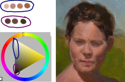 | |
| fig.1 |
whether you are drawing or painting keeping the effect of light is one of the most important elements in a piece. The key to this is to keep a tonal gap between your darkest tone in the light and your lightest tone in the shadow.This gap can be clearly seen it fig.1 where i have isolated the light tones and shadow tones from an oil portrait. there is a clear gap between the two bands of tone representing the light and shadow. so it stands to reason that the more tone you use in your lights the darker your shadows need to be in order to maintain the gap. if there is alot of modeling in the lights this may be necessary but can be over come by the use of temperature instead of value to represent smaller changes.
Monday, July 25, 2011
Toning the canvas and values for white.
Its a good idea to tone the canvas before starting to paint for several reasons. First of all it helps you to judge your dark tones as it is hard to see any difference between your darks if they are placed on white. Secondly it can be use a eiither the color cast of the scene caused by the light or as a complimentary color to vibrate and make the image pop. Lastly i would recommend toning the canvas in a tone that exactly matches the color of a white object in the light, if there are any spectacular highlights or light sources in the scene. this makes sure that you always have enough room to push up towards the brighter tones of the highlights.
Friday, July 22, 2011
procedure
over the last few days i have been trying several different painting procedures to see which one i handle the best. here´s the one i think ill settle for.......
1. lay in a general tone for the light. this tone should be the average for the tone in the light (not including spectacular highlights) this is important because you need some wiggle room to go lighter and darker later on without encroaching on the spectacular highlights or getting to close to the shadow tone and destroying the feeling of light. when we say "light" this includes all halftones. Generally your tonal difference inside the lights is much higher than the tonal range of the shadows. the light tone must be light, to give the appearance of a lit form.... generally this is lighter than a 5 step on the value scale.
2. Block in your shadows using as simple shapes as possible. Don´t forget to squint so you won´t confuse any halftone with shadow.
3. Add temperature changes to the lights. these can also include some of the slight value changes, but be careful not to make the area "spotty". This is also a good time to put in any turning edges and blend them appropriately.
4. Check your edges. You should be trying to get your edges right as soon as you lay down a stroke but its good to have time set aside to check anyway in-case you missed any.
5. Squint down again and look for all of the darker halftones, lay them in in the correct temperature as you go. make sure they don't approach anything near a shadow tone in value.
6. Add your highlights being careful with the temperature and blend them appropriately.
7. now add your dark accents and temperature changes to the shadow. The value in the shadow never changes (you have the shadow tone and the dark accent no more), all shadow form is turned with temperature.
Wednesday, January 26, 2011
keying diffused light situations

Wednesday, January 19, 2011
athmospheric persprective
a crucial part of painting that contain outside elements is atmospheric perspective. Shadow and light tones are affected differently as they recede but in a predicable manner. In both cases the hue shift is always to wards the color of the sky, in most cases this will be blue, but not always. In the shadows you will see big jumps in the hue of a color as it moves away from the viewer with relatively small changes in saturation. also shadow s will get lighter untill they approach the value of the sky itself.
Lights on the other hand will see a big change in saturation will relatively small changes in hue ( moving towards the color of the sky again) the value will move towards the value of the sky as well but in the case of lights it can get darker or lighter depending on the local color of the object. obviously the changes in value will be relatively small compared to the value changes in the shadows because it has less distance to travel to match the value of the sky. the changes in color of the lights is a direct mix of the main light source and secondary light source imposed on the object. so say the conditions are as follows.... the sky is yellow green and the main light source is orange-yellow. since both have a considerable amount of yellow in them objects with a local color of orange , yellow or gray will have considerable saturation as they recede compared to normal sunlight conditions (orange yellow main light and blue sky)

Lights on the other hand will see a big change in saturation will relatively small changes in hue ( moving towards the color of the sky again) the value will move towards the value of the sky as well but in the case of lights it can get darker or lighter depending on the local color of the object. obviously the changes in value will be relatively small compared to the value changes in the shadows because it has less distance to travel to match the value of the sky. the changes in color of the lights is a direct mix of the main light source and secondary light source imposed on the object. so say the conditions are as follows.... the sky is yellow green and the main light source is orange-yellow. since both have a considerable amount of yellow in them objects with a local color of orange , yellow or gray will have considerable saturation as they recede compared to normal sunlight conditions (orange yellow main light and blue sky)

Saturday, January 8, 2011
making composition managable
composition is one of my weakest areas. I say this even though I know all the conventional rules that are in place to guide artists. The problem for me is putting it all together. So ive been trying to come up with a process for thumbnailling. here is where I am right now.
1. Proportion of light to dark, working in just black and white the canvas must be divided into areas of light and dark. Either the light or dark must dominate in surface area. It is not necessary to group or link all your dark areas but it is well to note that most images will benefit from this.
2. Within the light and dark areas there must be interesting overall shapes. after the general proportion of light and dark is laid in it is best to make the shapes of these areas more planed while keeping the general proportion the same.
3. Edge complexity should diminish as you move away from the center of interest as well as complexity of shapes who's contours should be made of fewer lines as you move away from the focus of the piece.
4. Now you can start refining the objects in the light and dark shapes. It is better to give dominance of scale to one object or group of objects over everything else, generally this will be on or near the center of interest.
Thursday, December 16, 2010
new books
I received my copy of color and light by James gurney today and I'm half way through it already. Also ordered 4 other books. one is on facial expressions to help me along with non referenced heads and the other 3 are character poses to help me with weight and position for making poses out of my head.


Tuesday, December 7, 2010
currently reading
today i started reading andrew loomis´s book, "head and hands" and copying the illustrations. when i finish that its on to bridgemans complete guide to drawing from life and then gary faugains book on facial expression, all in the hope of being able to draw without reference.
Thursday, December 2, 2010
Lets stick to a learning schedule...
right lets try this on for size..
1 hour drawing head
1 hour drawing anatomy
1 hour hands
3 hour still life from life
2 hours of quick digital head studies
is that 8 hours already... maybe ill add more lateri´ll see how this pans out first...
oh and one extra hour landscape compositional studies
1 hour drawing head
1 hour drawing anatomy
1 hour hands
3 hour still life from life
2 hours of quick digital head studies
is that 8 hours already... maybe ill add more lateri´ll see how this pans out first...
oh and one extra hour landscape compositional studies
Subscribe to:
Posts (Atom)